Here's the issue: Historically the higher the resolution, the smaller text and photos appear on the screen. This happens because most graphics and interface elements we create for computers are raster types, meaning they're based on individual pixels and not inches. So if an element on our screen is, let's say, 100 pixels in height, on a very old 8" high screen with a resolution of 600 x 400, that icon will take 1/4 or 2" of the screen height. But, if you were to take the same sized screen and make it 2000 x 1000, that same icon, because the screen has a much higher pixel per inch (ppi), will take-up only 0.8" or 1/10th of the screen height. So, what's the problem? Our population is older and as we age, our eyes weaken, making these smaller elements more difficult to read and causing eye strain for those of us lucky enough to work on computers.
Solution? We need to start creating operating system and application UIs that are based on actual size versus pixel size. We can do this by making the switch from raster graphics to vector graphics. Vector graphics scale infinitely so no matter how small or big they are on the screen, the edges are smooth, crisp and easy to read.
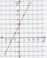
 Besides readability, there's another big benefit for making the switch to vector graphics: download sizes. As raster graphics have to include all color and position data for each and every pixel, as their size increases the amount of data increases. This is not so with Vector graphics, as a vector is, in simple terms, a line between two points - and because we're talking about a 2 dimensional screen, only two coordinate values are needed for each point...Remember the graphs you did for algebra class in high school.
Another reason for switching to vector graphics based on actual size on a screen, is the touch interface so many of us are now used to when using our iPhones, iPads, Android and other devices. Our fingers, within a limited range of measure, are similar in size and need a certain amount of space to operate. No matter the screen size and resolution, we need an actual and fairly consistent area for buttons. Currently operating systems decrease the physical size of buttons as resolution increases (given that the screen size is constant). Not a problem with a mouse or pen - but a big problem for fingers.
Having all of this screen real estate is wonderful, but if text and icons are too small to read, and buttons too tiny to push, these beautiful screens become useless.
No comments:
Post a Comment